
Evolving Brand Marks: Is Change Always a Good Thing?
3 Minute Read
The Brand You Grew Up With Just Got a Haircut
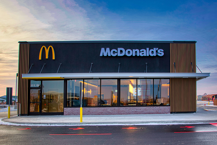
Remember when Pizza Hut dropped its red roof or when McDonald’s traded its golden arches playground for sleek, modern wood paneling? It’s a strange feeling—familiar but off. Brands are refreshing their look and feel at every turn, and while some updates are subtle, others feel like a full identity swap. It’s not necessarily bad, it’s just… different. If you’ve ever felt a twinge of nostalgia (or betrayal) over a redesigned logo or a rebranded building, you’re definitely not alone.
We’re living in an era of brand makeovers. Logos are slimming down. Fonts are going sans-serif. And once-iconic buildings? They’re being scrubbed clean of their retro quirks. The question is: does this modern glow-up come at the cost of emotional connection?
When Logos Go on a Wellness Journey
Let’s start with Cracker Barrel. You might have noticed, but they’ve given their logo a facelift. The front porch vibes are still there, but it’s been simplified—less rustic, more digital-ready. The same goes for Chevrolet. The iconic bowtie has gone through more iterations in the last decade than a Windows operating system.
But here’s the catch: do people even notice? And if they do, does it matter?
Turns out, yeah, it kind of does. A logo isn’t just a symbol. It’s shorthand for memories, pride, and in some cases, identity. When Chevy fans see that bowtie, they don’t just think “car”—they think family road trips, Friday night cruises, and trucks that “ain’t never gonna die.” You mess with that symbol, you’re not just updating a look. You’re rewriting personal history.
Source: 1000logos.net
The Rise of the Lovemark
In the early 2000s, ad exec Kevin Roberts coined the term “lovemark”—a brand that people don’t just buy from, but actually love. These are the brands that live in our hearts, not just our shopping carts.
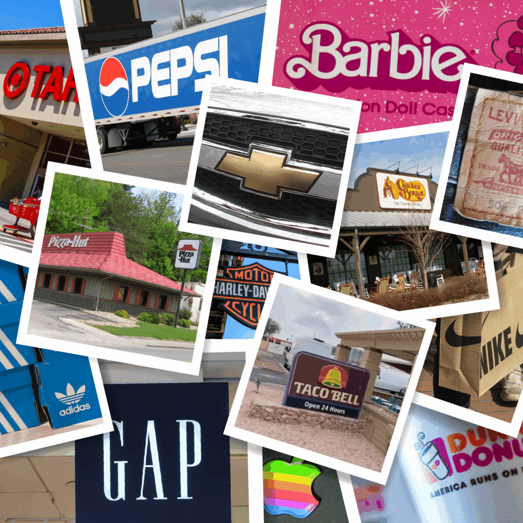
Think Harley-Davidson. Apple. Nike. Chevrolet.
Some people are so loyal, they’ll literally ink their skin with the brand. There are Chevy bowtie tattoos out there that have outlasted marriages. So what happens when that beloved logo suddenly looks like a tech startup? It’s like waking up one morning, and your grandpa is wearing skinny jeans. You still love him… but you’re concerned.
When the Buildings Stop Looking Like Themselves
Logos aren’t the only thing getting a makeover. Take a look at McDonald’s, Wendy’s, or Taco Bell; chances are, the last time you visited one, it didn’t look like it used to. Gone are the iconic red roofs, neon lights, and whimsical shapes. In their place? Sleek, muted exteriors with lots of black, gray, and faux wood. More upscale, less “birthday party in 1993.”
There’s a strategy here. These brands aren’t just flipping burgers; they’re building real estate empires. When a franchise location shuts down, the corporation still owns the land. But if the building screams “this used to be a McDonald’s,” it’s tough to lease it to anyone else. So now, the goal is architectural neutrality. Make it easier to flip, reuse, or resell.
From a business standpoint? Genius. From a nostalgic standpoint? Kind of a bummer.
Source: QSR Magazine
The Emotional Receipt We All Carry
At the end of the day, this isn’t just about logos or buildings. It’s about the emotional receipts we carry with us; the way a brand becomes part of our story. We grow up with these symbols. We assign them meaning. And when they change, we can’t help but feel like something’s been lost in translation.
Think about the last time you saw a “vintage” version of a logo you grew up with. There’s a reason those retro designs spark joy. They remind us of a time when things felt simpler…or at least, more familiar.
So when brands modernize, maybe they’re not just updating for the digital age. Maybe they’re taking a calculated risk: trading recognition for relevance.
It’s Just a Logo… Until It Isn’t
Brand evolution is inevitable. But the best brands know when to hold on to the past and when to let go. Because once your logo becomes someone’s tattoo, it stops being just a mark. It becomes a lovemark, and that kind of loyalty is worth preserving.