
The Most Expensive Billboard You Can’t Turn Off
3 Minute Read
The Era of Homogenized Storefronts
Drive through any newly built shopping center, and you are met with a sea of sameness: beige stucco, grey cladding, and generic glass boxes. A Chipotle can close on Friday, and a Verizon store can move in on Monday without changing the structure. This is the era of Homogenized Storefronts, a design strategy prioritizing flexibility and interchangeability above all else.
This modern blandness is a direct reaction to the architectural hangovers of the past. It is the structural opposite of the strategy that defined the pre-Internet suburbs, where buildings weren’t designed to be swapped, but designed to be impossible to ignore.
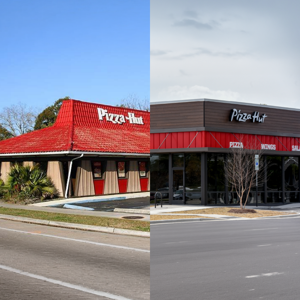
The “Used To Be a Pizza Hut” Phenomenon
We have all played the game. You are driving past a generic tax preparation office, but you know the truth. You see the trapezoidal windows. You see the distinct red shingled roof. Your brain signals “pepperoni,” even though the sign says “Tax Help.”
Looking back, that distinct red roof wasn’t just an architectural choice. It was an advertising strategy.
The Building Was the Media Buy
In the pre-Internet era, brands like McDonald’s and Pizza Hut didn’t have geo-targeted Instagram ads or Google Maps pins to tell you where they were. They had to rely on physical “interruption marketing.”
They pioneered Branded Architecture as the ultimate Out-of-Home advertisement. The strategy was brilliant: turn the building itself into a 3D billboard.
By standardizing the structure, the Golden Arches and the red roof hacked the consumer’s brain. They created a “distinctive brand asset” that was visible from the highway at 70 mph. It was a one-time capital expense that acted as a 24/7 advertisement for decades. They didn’t need to buy a billboard down the street because the building was the billboard.
The Real Estate Hangover
The downside of a “permanent billboard” is that you can’t take it down when the campaign ends.
This is the “McDonald’s Curse.” When these businesses close, the landlord is left with a building that is structurally screaming a specific brand message. To turn a shut-down McDonald’s into a bank requires “de-branding” the bricks. If you don’t, the new business feels like a squatter. The ghost of the Big Mac lingers because the advertising is baked into the foundation.
The Shift: From “Look at Me” to “Find Me”
So why are modern storefronts becoming more generic? Advertising has moved from the street corner to the pocket.
We no longer scan the horizon for a red roof to find dinner; we simply pull out our latest smartphone and type “food near me” into our favorite maps app. Since the digital ad does the heavy lifting of acquisition, the physical building no longer needs to scream. It just needs to exist. This allows brands to move into grey shells, creating flexible spaces that are cheaper to build and easier to exit.
Adaptive Reuse: The Story of 23510 Woodward Ave.
However, there is a difference between “Branded Architecture” (a gimmick) and “Functional Aesthetic.” To understand this, look at the history of the Strive Creative office in Ferndale.
Built in 1945, the building didn’t start as a creative studio. For over 50 years, it was Geake’s Sporting Goods, a local landmark where generations bought fishing tackle and skis. In the 2000s, the space evolved into Detroit Brothers Custom Cycles, a gritty workshop famous for building industrial choppers on the Discovery Channel.
Today, that same footprint houses Strive, a digital marketing agency.
How can one building transition from fishing poles to motorcycles to computer desks without feeling awkward? Because the original design wasn’t an ad; it was a function. The building relied on “good bones,” open space, strong materials, and utility.
Unlike a Taco Bell that looks wrong as a bank, the industrial aesthetic of the Strive office works because it’s authentic. The concrete floors that once held motorcycles now house a modern office, proving that while brands change, utility endures.
The Lesson for Marketers
This shift teaches us a valuable lesson about the difference between Trends and Utility.
The “Pizza Hut Roof” was a trend-based ad campaign made of wood and concrete. It worked until the market shifted, leaving behind an awkward relic. The building on Woodward Ave. was built for utility, allowing it to evolve from Geake’s to Detroit Brothers to Strive.
In marketing, as in architecture, if you build your strategy entirely around a specific gimmick (or platform), you risk becoming obsolete. The goal is to build a brand with strong bones, one that can inhabit new spaces without losing its soul.