
The Button That Isn’t Really a Choice
3 Minute Read
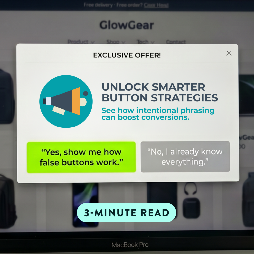
You’ve seen it before. A pop-up appears on a website offering a discount or a free download, and below it, two buttons:
“Yes, I Want to Save 30%!”
“No thanks, I enjoy paying full price.”
You almost laugh, but you also click yes. That’s not a coincidence. That’s a false button, and it’s doing exactly what it was designed to do.
What Is a False Button?
A false button (also known as “confirm shaming” or a “negative opt-out”) is a copy and design strategy where users are presented with two options, but one of them is clearly the right answer. The second option isn’t really a viable choice; it’s there to crystallize the value of the first button by making the alternative feel a little ridiculous.
These show up most often in pop-ups, exit-intent overlays, email opt-ins, and landing page CTAs. And once you start noticing them, they’re everywhere.
The Marketing They’re Actually Doing
It’s worth understanding what a false button is actually solving. Most users who skip a CTA don’t do it because they actively don’t want what’s being offered. They skip it because the value didn’t land clearly enough, or because the ask felt like too much friction.
A false button addresses both of those things at once. By spelling out exactly what someone is walking away from, it removes ambiguity and makes the offer feel concrete. That’s a copywriting win before it’s anything else.
There’s a secondary benefit, too. The framing naturally encourages users to self-select. Someone who genuinely isn’t the right fit will still click no. But someone who was on the fence gets a small, well-timed nudge that brings the value back into focus.
It’s Copy and Design Working Together
The words only tell half the story. The visual treatment of a false button is doing just as much heavy lifting. The yes option is typically bold, high-contrast, and styled as a prominent button. The no option is usually plain text, smaller, and visually subordinate. That hierarchy isn’t accidental; it signals to the user before they’ve even read the copy which choice is the intended one. When design and copy are aligned, the false button becomes something greater than the sum of its parts.
First-Person Copy Takes It Further
One thing the best false buttons have in common is first-person language on the yes option. When ContentVerve changed a CTA from “Start your free 30-day trial” to “Start my free 30-day trial,” they recorded a 90% increase in click-through rate, as noted by Unbounce. The shift from “your” to “my” makes the action feel like the user’s own idea rather than a request being made of them. Pair that with a no option that sounds absurd by comparison, and you can have a genuinely effective conversion combination.
Where Marketers Get It Wrong
The tactic earns its share of criticism, and usually for good reason. One analysis found that while aggressive opt-out tactics can generate short-term email signups, a significant portion of people who encounter them walk away with some level of irritation tied to the brand. A guilt-tripped subscriber is rarely a loyal one.
Overuse is just as big a risk as getting the tone wrong. A brand that leans on false buttons across every touchpoint trains users to tune them out entirely, which defeats the purpose. Used selectively and in the right context, they can carry weight. Used everywhere, they become noise.
A few guardrails worth keeping in mind:
Stay proportionate. The no option should feel like a graceful pass, not a personal attack. “No thanks, I’m good” is an opt-out. “No, I hate saving money” starts to feel condescending depending on context and audience.
Match your brand voice. A false button that sounds nothing like the rest of your site sticks out for the wrong reasons. The best ones feel like a natural extension of your copy, not a last-minute add-on conversion trick.
Know where they work best. Exit-intent popups and email opt-ins tend to be the highest-performing placements because users are often already at a decision point. Dropping one mid-page or in a low-stakes context tends to feel forced and produces diminishing returns.
Test it. Like most conversion tactics, what works for one audience may fall flat for another. As we’ve covered in our look at A/B testing, small copy changes can move numbers.
The most effective examples tend to stay in familiar territory:
- “Yes, sign me up! / No thanks, I don’t want more website traffic.”
- “Claim My Free Guide / I already know everything I need to know.”
- “Start My Free Trial / I prefer paying more for less.”
The slight humor keeps things from feeling manipulative and actually builds a moment of brand personality into what would otherwise be a routine pop-up.
A Small Button With a Real Job to Do
False buttons work because good marketing copy has always been about framing. When someone understands exactly what they’re saying yes to and exactly what they’d be leaving behind, the decision gets a lot easier to make. That’s true whether you’re writing a headline, a landing page, or a two-line CTA. If you want copy and web design that thinks this carefully about every touchpoint, that’s exactly the kind of work we do at Strive Creative. The small details tend to be where the results are hiding.